
Coin Plan
A Subscription and Finance Management Tool
Names and images were changed to protect anonymity.
Empowering People on the Go
Coin Plan organizes subscriptions to reduce spending. Launched as a desktop-only website, stakeholders wanted an app to attract more users.
They wanted people to be able to:
See subscriptions in one place;
Unsubscribe from subscriptions; and
Get notifications about upcoming auto-renewals.
Research-Driven Approach
This was a five-week solo UX Research and UX/UI Design project. Designs were delivered three business days ahead of schedule.
Discover
Project Plan
Research Plan
Competitive Analysis
Written Summary
Design
User Flows
Wireframes
Low Fidelity Prototype
High Fidelity Rendering & Prototyping
Validate
Participant Recruitment
Lo & Hi-Fi Usability Test Scripts
Lo & Hi-Fi Moderated Usability Tests
Usability Test Reports
Stakeholder Presentation
A Saturated Space
Competitive Research
Five industry leaders were competitively analyzed.
Trim
TrackMySubs
PocketGuard
Rocket Money
Hiatus
Mint offered UI and user flow inspiration.
Synthesis
Learnings were shared with stakeholders and applied to designs:
Design minimally to avoid overwhelm.
Build trust with color psychology and confidence with a positive voice and tone.
Create intuitive information architecture for quick and easy navigation.
Offer customizable features to help people feel in control of their finances.
Intuitive Design Builds Trust
Information Architecture
People want to get in and out of finance apps quickly. User flows were designed accordingly.
User Flows for the three user stories stakeholders requested
Style Guide
Coin Plan style represents its brand attributes. Blue builds trust, while Poppins feels friendly.
The colors create a trustworthy, caring vibe.
Sans-Serif font Poppins has a friendly, casual vibe.
Minimal styling show respect for users’ time.
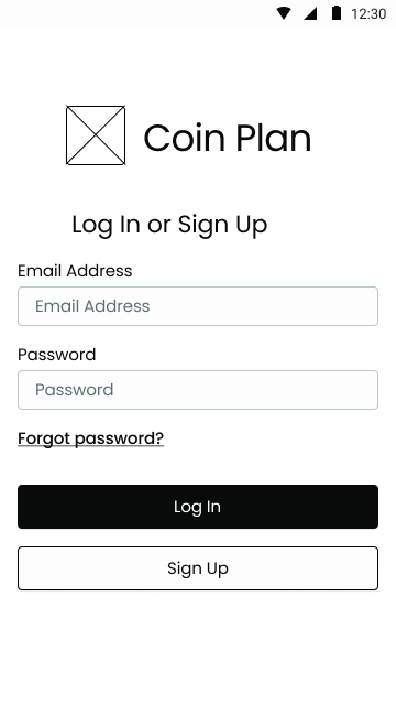
Initial Designs Focused on Simplicity and Trust
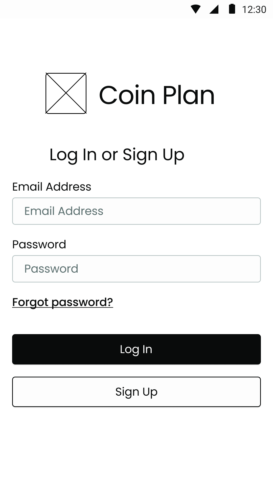
Security was communicated with a two-step login process.
Current User


OTP
Home
Log In
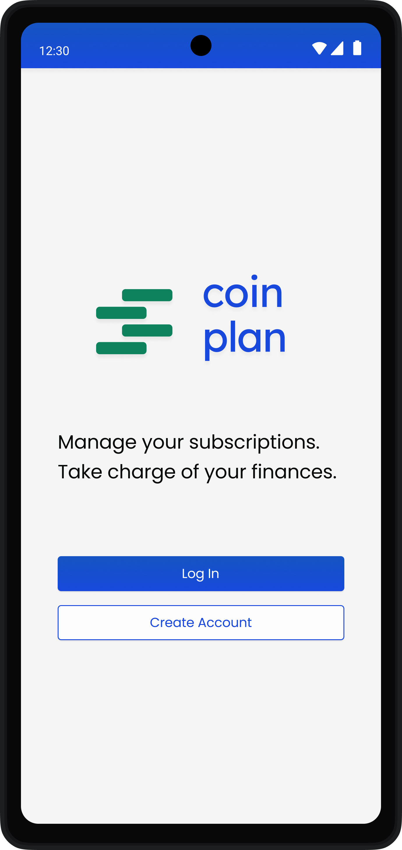
Splash
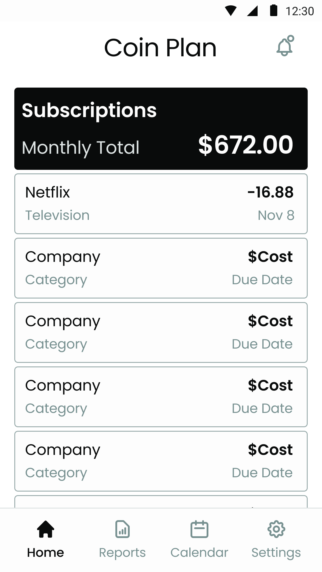
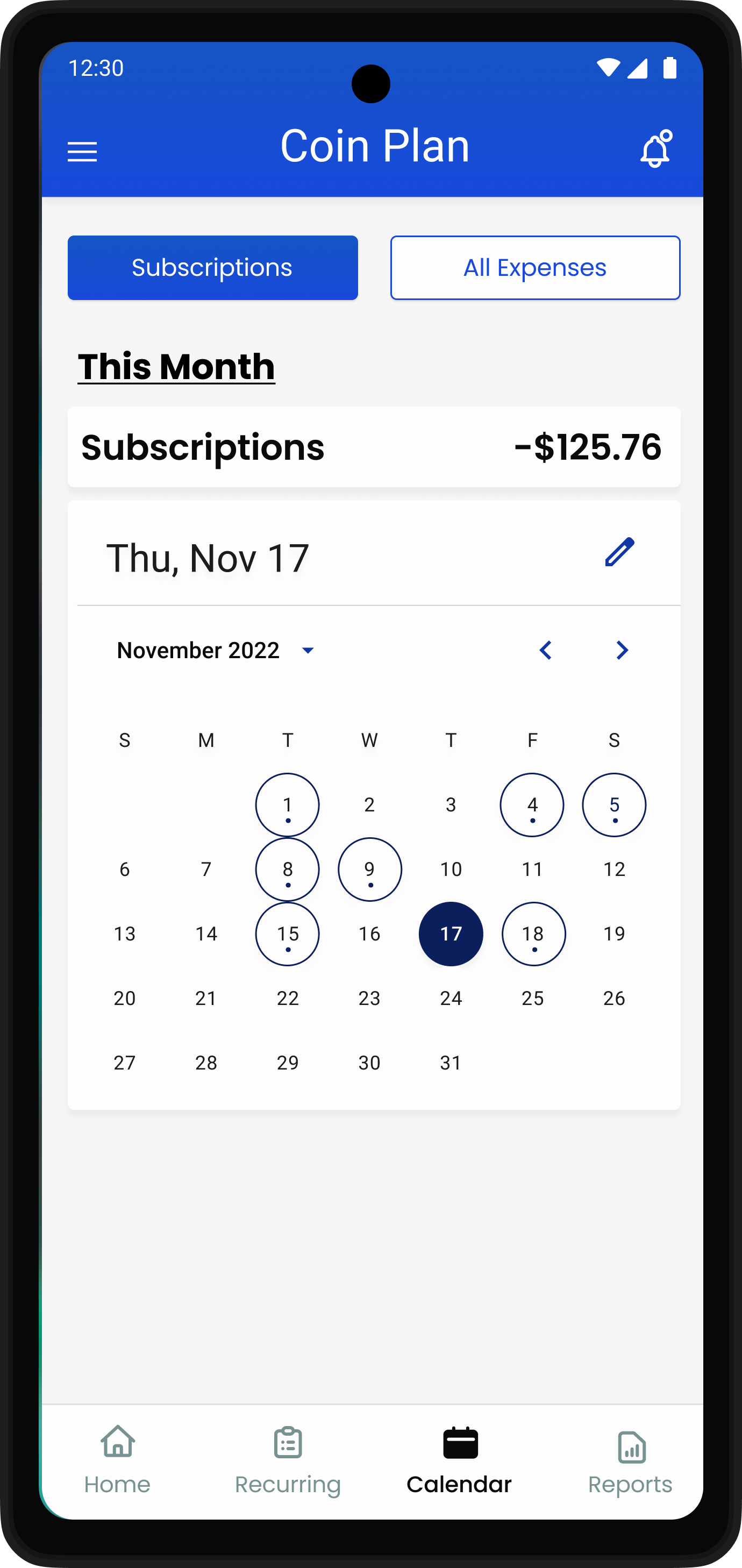
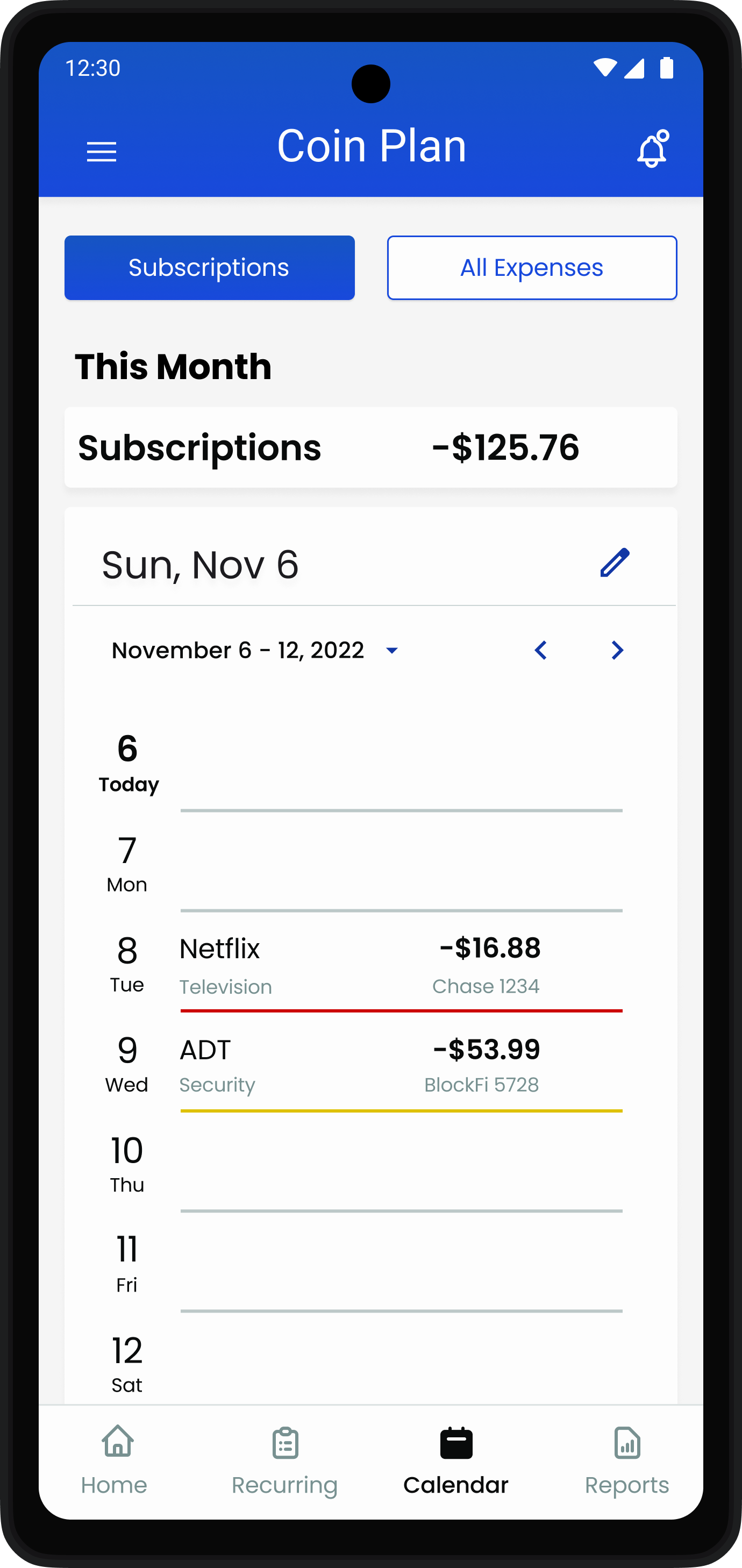
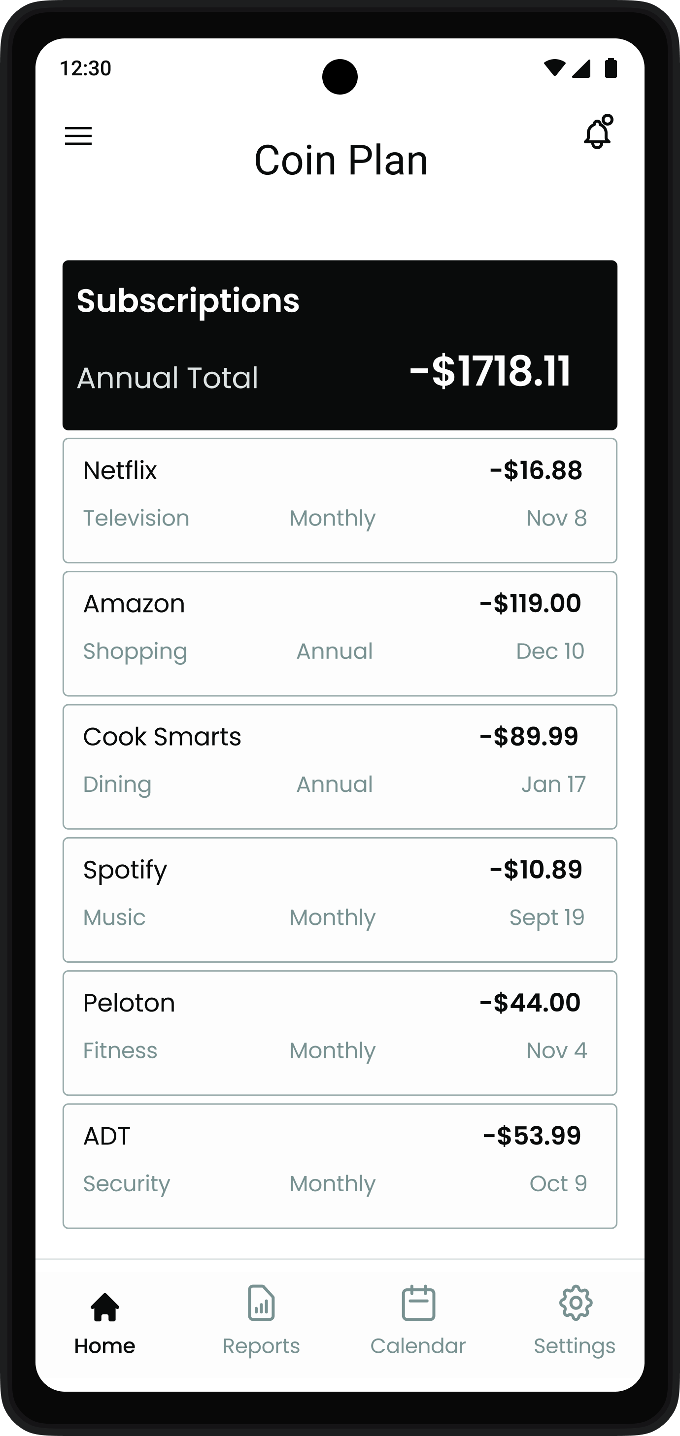
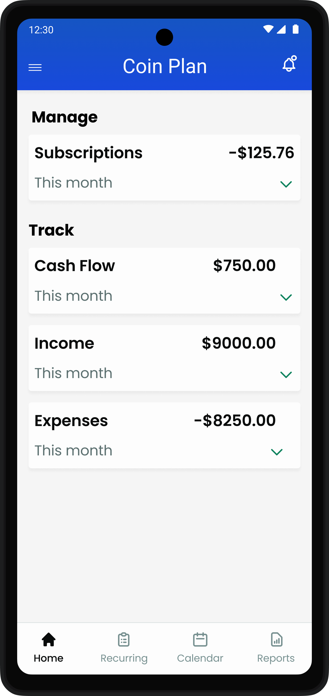
All subscriptions in one place (the home screen)
Returning User
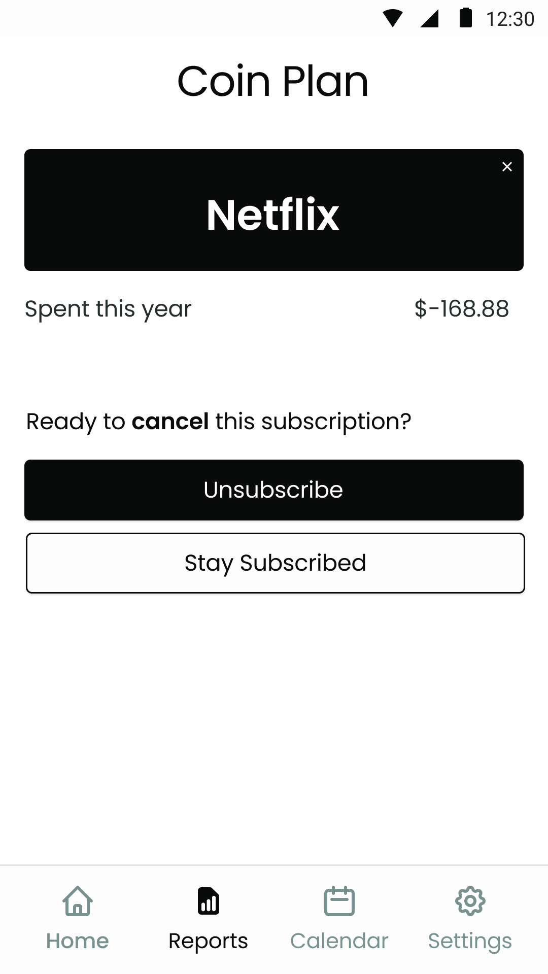
People can unsubscribe on a subscription’s report page.


Confirm Identity
Home
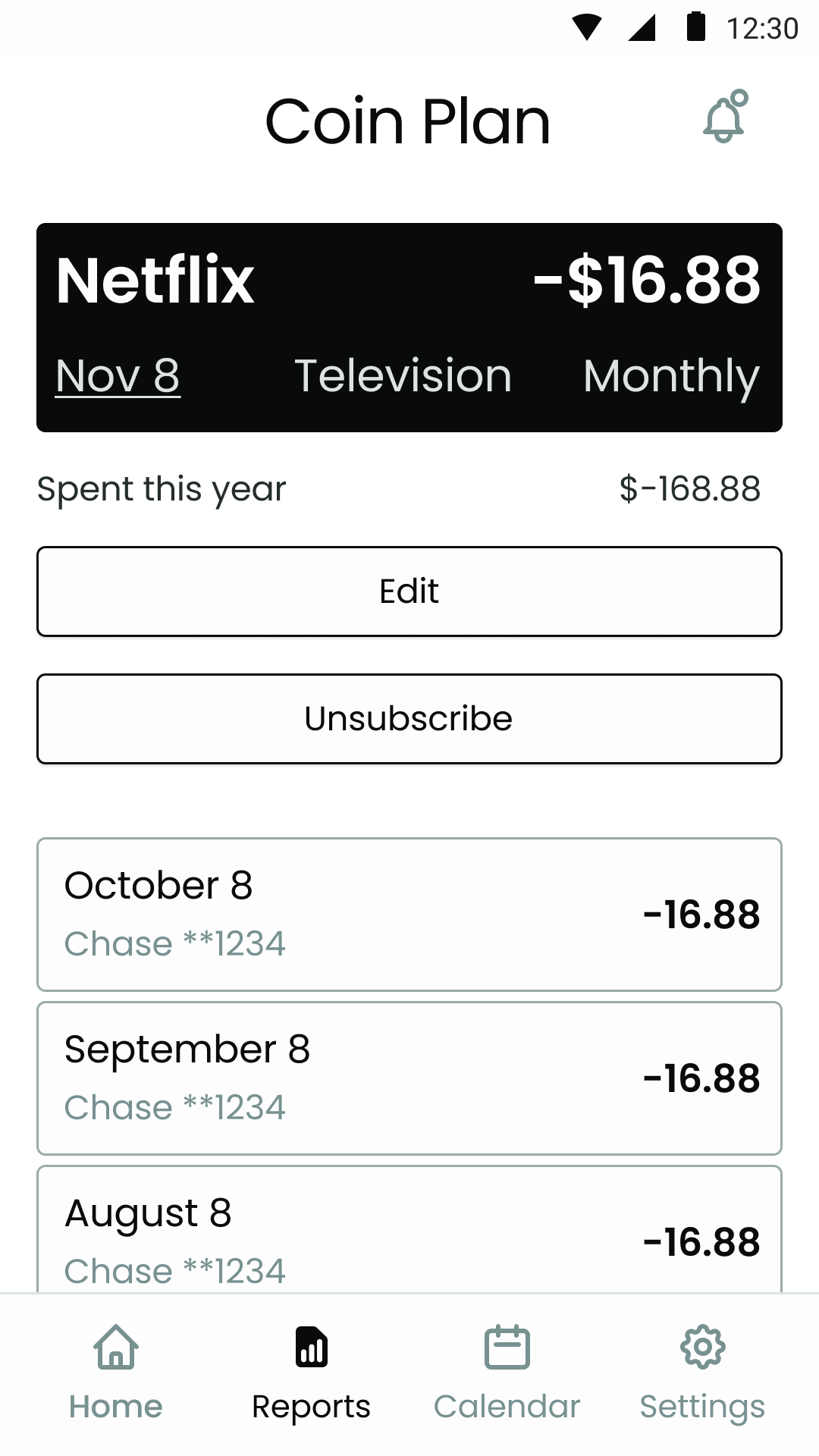
Report
Unsubscribe

Confirmation
Unsubscribe to reduce spending
Consumer
Get notified about auto-renewals.

Splash
Log In

Confirm Identity
Home
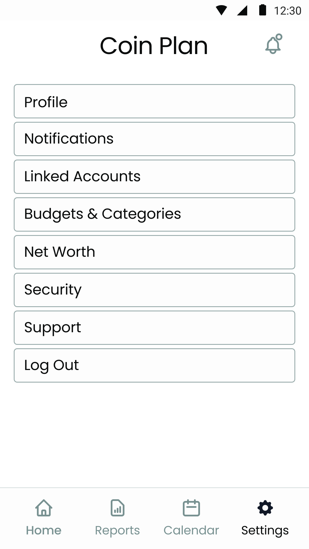
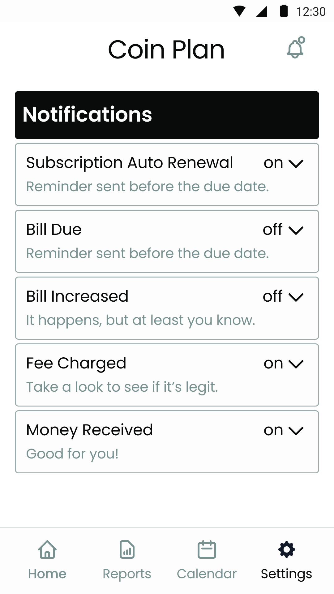
Settings
Notifications
Log In
Splash
People can edit notifications in settings
The Prototype
Moderated usability tests of the low fidelity prototype followed a semi-structured script. The Test Report influenced high fidelity designs.
Moderated Usability Test Participants
Ten people tested prototypes (five lo-fi, five hi-fi). Their demographics varied to produce richer insights.
Gender
Men: 40%
Women: 60%
Age
30s: 50%
40s: 50%
Finance Tracking
Banking apps: 30%
Google Sheets: 20% Microsoft Excel: 10% Nothing: 30%
Paper: 10%
Industries Represented
Most participants work in tech.
U.S. Regions Represented
Most respondents were Midwesterners.
People Liked the Simplicity but Wanted More (Lo-Fi)
What Worked
“I like that it’s very simple. It’s not noisy with a bunch of unnecessary information.”

Henry
“Seems straightforward compared to other apps I’ve used.”

Alex
“That was really easy. I didn’t have to think about it.”

Zoe
What Didn’t
60% went
home to log out instead of settings
20% wanted
to see billing accounts on the subscriptions list
to return to subscriptions after unsubscribing
to toggle between monthly and annual costs in subscriptions list
a subscriptions pie chart
High Fidelity Prototype
Findings and insights were incorporated into the hi-fi designs and prototype.
What Changed
Information Architecture
Navigation improved by:
adding categories for faster scanning.
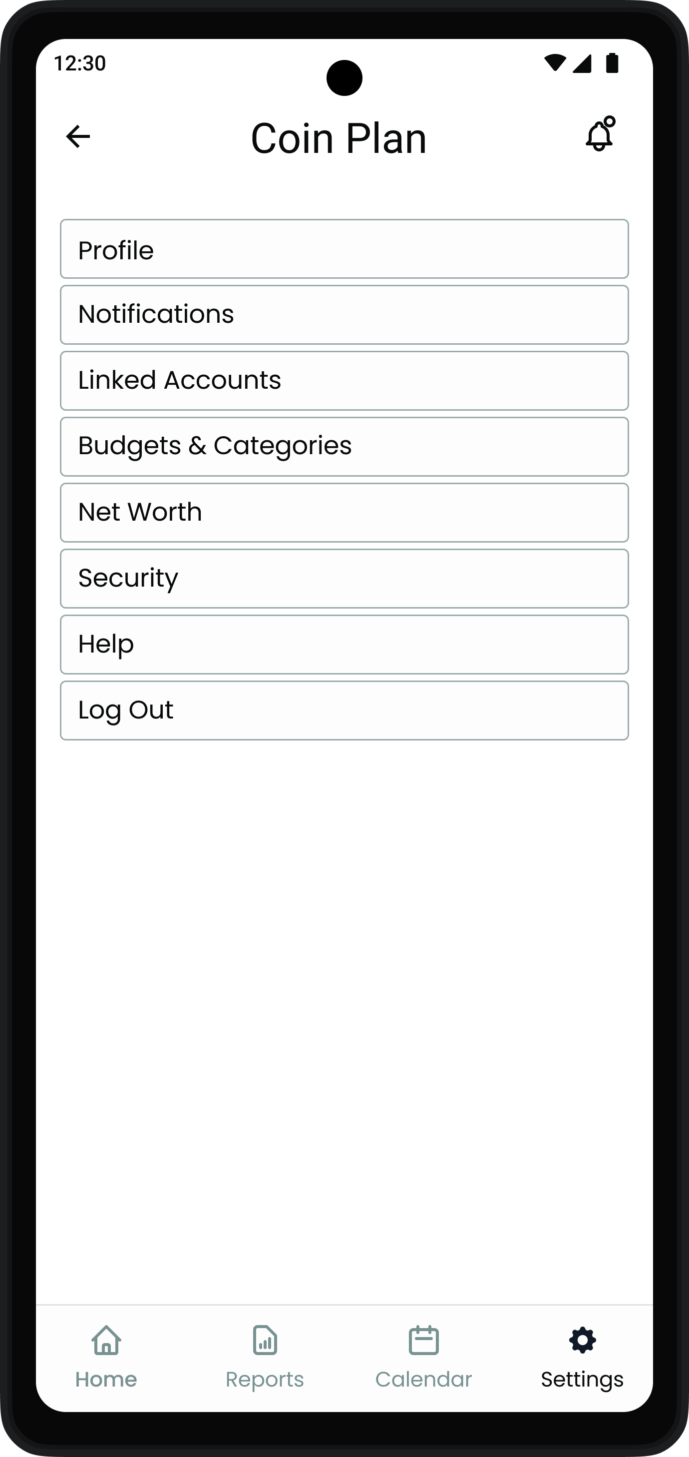
replacing settings with recurring expenses to show things like subscriptions, insurance & events in one place.
UX Design
Test participants had trouble tracking finances because they have lots of accounts. They wanted to see how subscriptions impact spending money. The app expanded to include cash flow, income, and expenses. This helps people understand their financial health.
People Liked the Intuitive Design (Hi-Fi)
Five usability tests were conducted using a test script. Findings were shared in a test report.
What Worked
Uma
“Sometimes they put a lot more items on the screen. You get confused where to go. This was pretty straightforward. It had the minimum things you need to do. So from a usability perspective I thought it was pretty good.”

Vikram
“It’s simple and effective, only showing the data that’s needed.”

“I like that my subscriptions are at the top, all bundled together. But also hidden so it doesn’t take up too much room. They’re very easy to find.”

Olivia
What Didn’t
60% had
trouble clicking the Back button and Burger Menu. The frames had been deleted.
40% wanted
to preview calendar information
20% felt
the logo was not exciting
Iterated Design Prototype
The prototype improved thanks to user testing.
What Changed
UX Design
Accessibility improved with:
increased touch targets
an added log in interaction
Functionality was added with:
calendar previews
upload button
Original Calendar
Iterated Calendar

Upload reports to people
UI Design
A Burger Menu replaced the Reports’ Back button to improve consistency.
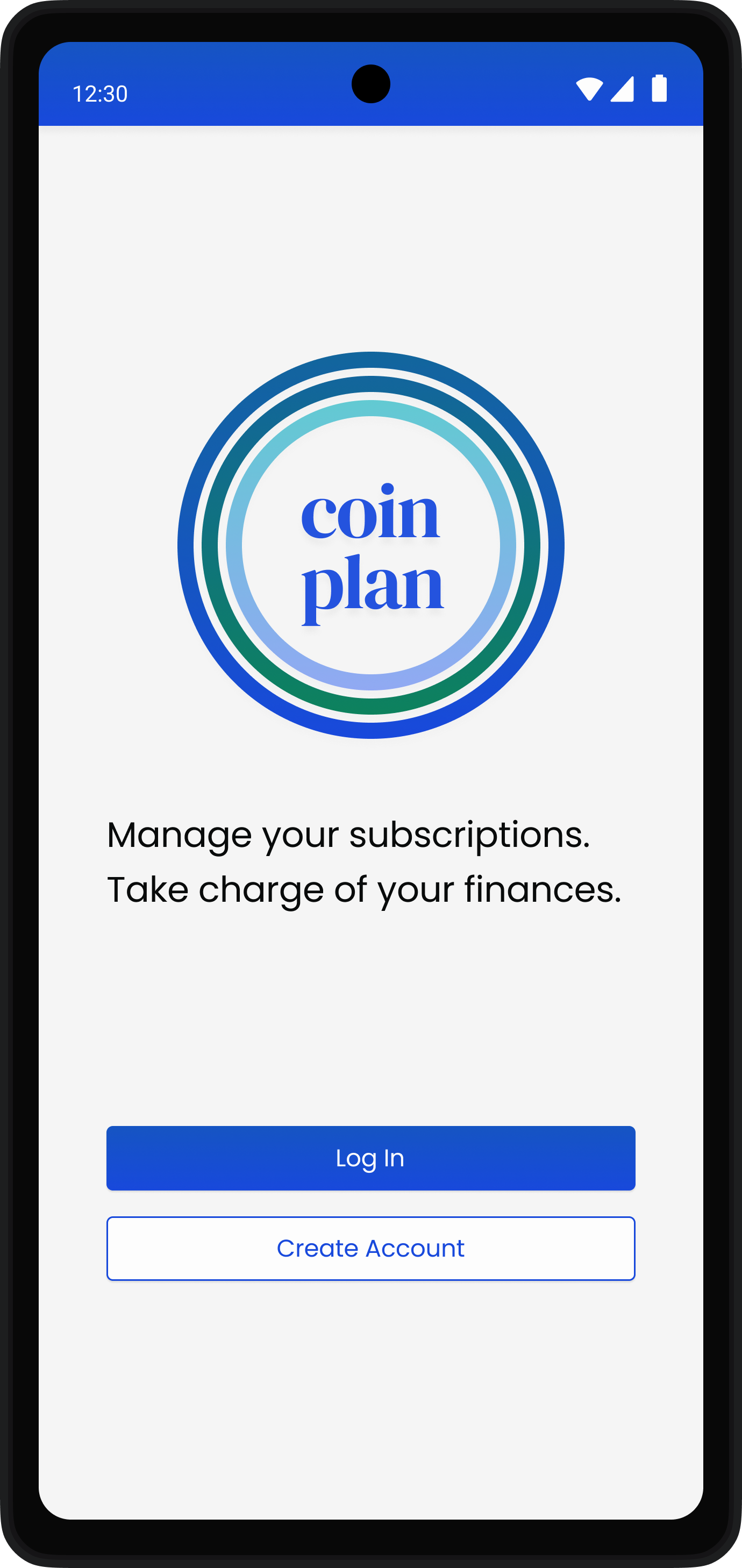
The logo was redesigned, retaining simplicity while adding interest.
Improved logo
Original logo
People Liked Having a Simple Finance Management Tool
“The personality is caring. It wants to help.”

Tingting
“I like the simplicity of it. How clean it looks. How easy it is to manage and take charge of your finances.”

Annika
“Very simple, approachable design. It seems geared towards people who don’t have a lot of time. Just want to get in, get out, and feel in charge of their finances.”

Ashish
“Nowadays everyone has a lot of subscriptions and we don’t even know what we’re paying for. I think it’s good for everyone to have a snapshot of their finances. This is a very straightforward, easy way to do it.”
Olivia
What I Learned
Some competitors show net worth. Stakeholders saw this as a weakness. Most people would not input enough information to get accurate results. So net worth was not included.
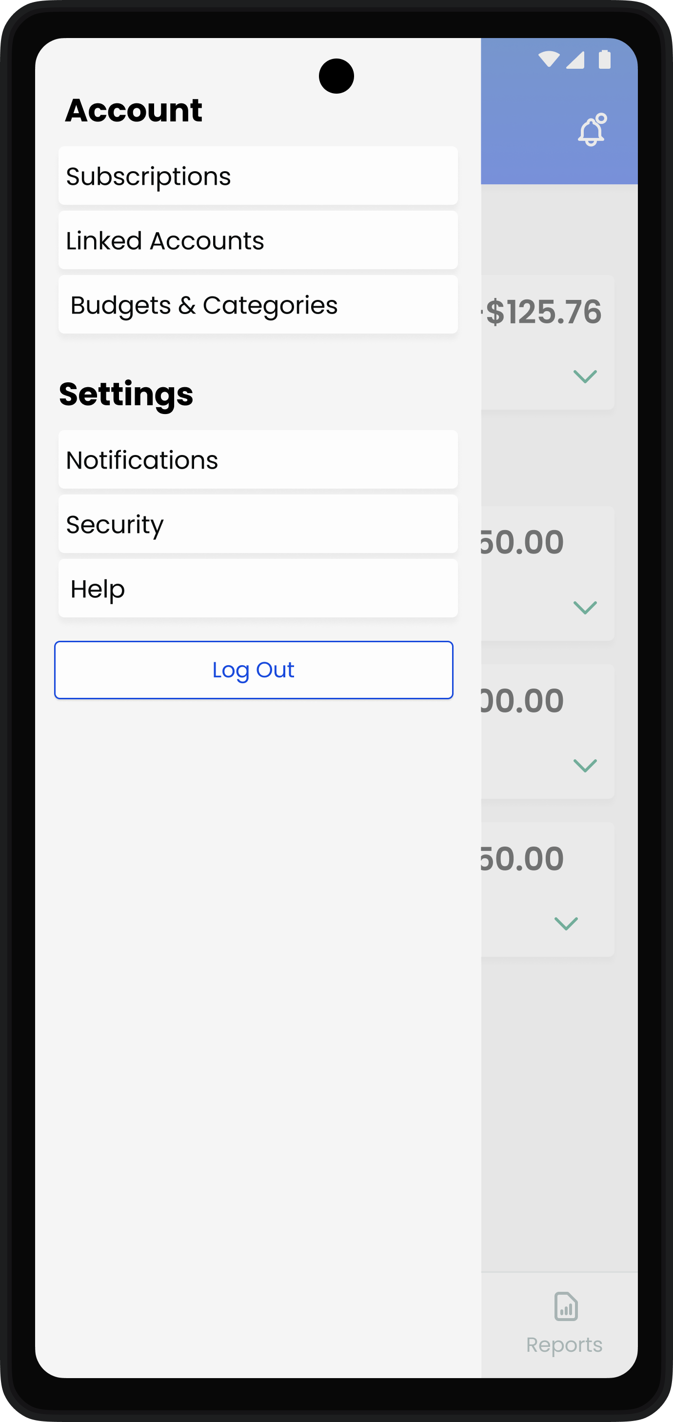
Only 40% of participants went to settings to sign out. This is the wrong place to store the log out button.
Lo-fi Log Out Button
Lo-fi Home Screen
Moving the log out button to the burger menu and deleting the setting icon increased log out success on first-attempt to 100%.
Hi-fi Log Out Button
Hi-fi Home Screen
Next Steps
Stakeholders plan to expand to Germany. Usability tests should be conducted there before release.
Create short training videos and store them under Burger Menu → Help → Onboarding.
Feature expansion
Test participants wanted to:
Customize notifications
Disable subscription auto-renewals.
Alert upcoming variable expenses.
Create trend reports with customizable dates.
See a sortable history of unsubscribed plans.
Track investments.
See and pay credit card balances.
Keep it Simple
100% of testers said Coin Plan’s minimal design made things easy to find. As features are added, ease of navigation may go down, harming usability. Before adding features, think about if they’ll help people achieve their goals. If not, don’t add them.