
PostUp
An Offline App for Remote Workers

The Forgotten Remote Worker
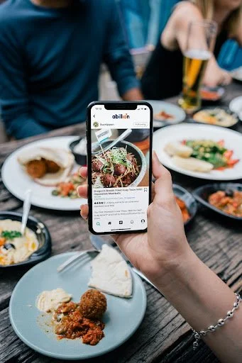
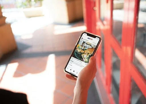
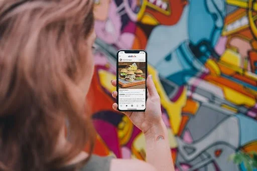
PostUp gives teleworkers a place to share advice and resources.
Recent forum posts lament on time wasted sifting through reviews for information needed to select a good place to work. PostUp’s app is the answer to that call.
Typical food & drink centric reviews teleworkers see when looking for a worksite. None highlight critical information like bathroom & outlet access or WiFi reliability.
Bringing Them to the Forefront
Goal
To help remote workers quickly find great places to work.
Constraints
The solution must be an offline mobile app.
Suggestions must be public places.
PostUp will trade time savings for a subscription fee of $5.99/month.
Time
Role
User Experience (UX) Designer, UX Researcher, UI Designer
Tools


Methods
Design
Lightning Demos
Crazy 8’s
Sketch
Storyboard
Discover
Map
Validate
High Fidelity Rendering & Prototyping
Participant Recruitment
Usability Test Script
Remote Usability Test
Iterate Based on Test Results
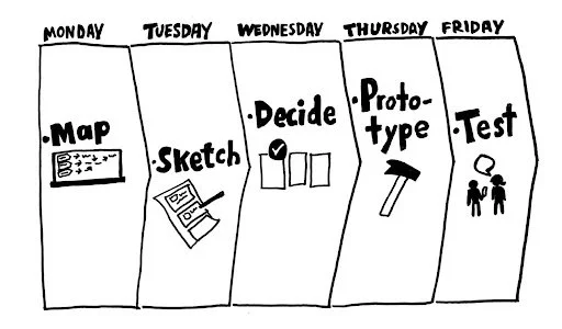
The Sprint
Empathize - Day 1
Several themes were found after UX Researchers interviewed 10 users.
They Need
Reliable WiFi
Quiet space for phone calls
Bathroom access
Outlets
Enough tables to stay a while
They Prefer
Free WiFi password
Good food/coffee
Other remote workers (feels friendlier)
They Said
“I know a lot of places to go near me, but I’m often in other parts of the city and need a place nearby to post up for an hour or two between meetings.”

Rhonda
“I usually need to jump on the computer for a video chat - so I need to make sure the WiFi is good and that there isn’t too much background noise.”

Andy
“If a place has WiFi, outlets, and bathrooms - that’s all I need. If I need to buy some food or coffee to stay there, I really don’t mind. Bonus points if their coffee and food are actually good!”

Claire
“I like to know how crowded a place is. If I’m doing independent work I don’t want it to be super loud. If I’m meeting clients or coworkers there, I want to be sure we can get a place to sit and talk for a bit.”

James
“I usually look at pictures of the place before I go, just to make sure there’s enough room for me and my coworker to take a table without feeling guilty.”

Adam
Map
Once I understood Rhonda, Andy, Claire, James, and Adam’s needs and pain points, I mapped their user flow.
remote worker → launches app → views map with nearby work-friendly businesses → selects one → *views photos of space, reads amenities/hours/busy times → returns to map, repeats process as needed → selects location
*reserve a table for the cost of a pastry (can go towards purchase if they show up)
Define - Day 2
I analyzed competitors, searching for features that would help Rhonda, Andy, Claire, James, and Adam.
Competitive Analysis
Competitors ranged from food and dining to maps, fitness, events, and real estate. The most inspiring apps were Google Maps, Apple maps, Yelp, and Redfin were the most inspiring.
Google Maps
Business type icons
Latest nearby
Yelp
Redfin
Filter free search
Drawing tool
Apple Maps
Business-type icons are used. The map is less obstructed by search since it’s at the bottom.
Yelp
People can search nearby businesses without filtering by type. This allows them to have richer data on nearby places.
Redfin
Searches can be narrowed by address, neighborhood, pinching and grabbing, or with the drawing tool.
Group filter & sort
Google Maps
The UI is clean and consistent. Business type icons and nearby suggestions make for fast selections. Search filter/sort options are grouped together.
Apple Maps
Filter at the bottom
Crazy 8s
I spent 8 minutes sketching potential ways to show Rhonda, Andy, Claire, James, and Adam nearby businesses that make great spots to telework. The sketches were map-centric. Some have a Happenings section (like Google Maps’ latest in the neighborhood feature). Others have a drawing tool (like Redfin). Some show results at the bottom (like Apple Maps).
Crazy 8 sketches of a map.
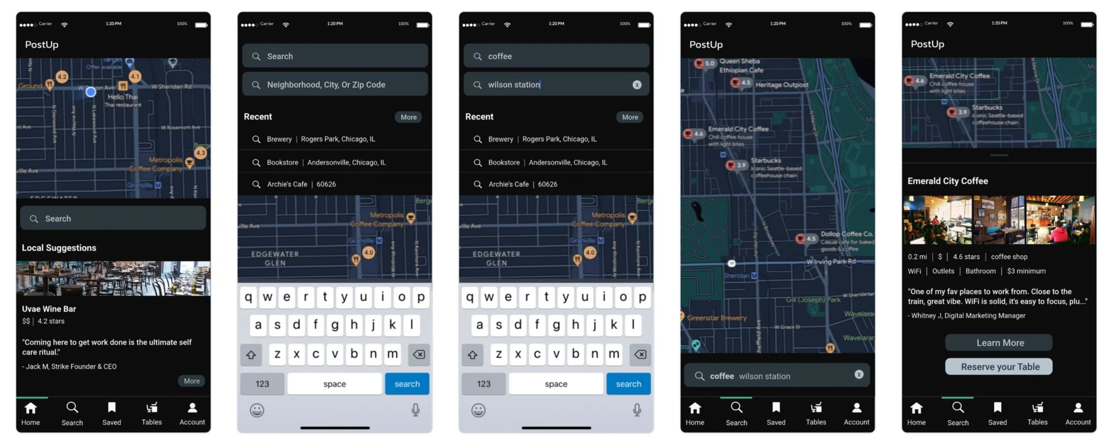
Solution Sketch
Left to right: home, results, and business info
Home
A map of nearby businesses to telework from. Searchable by location, business type, etc.
Results
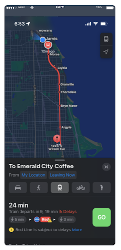
When someone selects one of the businesses, they’ll see the middle screen. The map shows critical business information. People can reserve a table for the cost of a drink (amount varies).
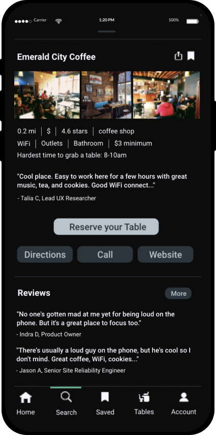
Business Information
Shown when people tap to learn more about a business. Reviews are written by remote workers, focusing on what it’s like to work there.
Ideate - Day 3
Assumptions
Rhonda, Andy, Claire, James, and Adam:
will sometimes use PostUp in their desired location. Other times they’ll use it in advance to look for places to work. A geolocate feature and an address/neighborhood search field address both search methods.
have changing needs and enjoy variety. So different types of businesses should be recommended. Workplaces can include coffee shops, tea shops, cafes, coworking spaces, wine bars, breweries, and bookshops. User interviews revealed libraries are not a good fit due to noise constraints.
Storyboard
Since this was a solo project, I quickly decided my solution was best. The storyboard shows what people would see if they wanted find a place to work, book a table, or get directions.
Search
Map
Results
Info
Reservation
Preferences
Date/Time
Confirmed
Directions
Prototype - Day 4
High Fidelity Designs
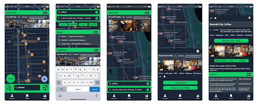

Once someone searches for coffee, they tap Emerald City Coffee to learn more. They can get directions or reserve a table.
Test - Day 5
Participants
Remote usability testing used a test script.
Five people participated: three women, two men.
Participant industries ranged from site reliability to accounting.
Testers were told they’d be using the train and asked to pick a local coffee shop near the station.
Findings
100%
100%
Liked Hardest Time To Get A Table
Didn’t understand Happenings
80%
60%
Would subscribe
Liked the opportunity to network
60%
40%
40%
Wanted to toggle networking on & off
Strongly disliked how much green was present
Would use PostUp to reserve a table
20%:
found the content useful, but didn’t want to spend money on free information.
said Waze is their favorite map app.
wanted to know WiFi strength.
wanted to edit the reservation in the app.
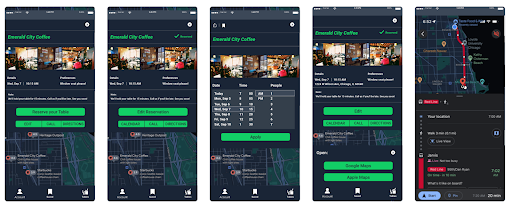
Iterated Design
UX Writing - more clarity
No one understood what the “Happenings” section was. I changed the name to “local suggestions” and moved it to the bottom.
UX Design - more functionality and choice
The date picker has individual chips for date, hour, minute, am/pm, and people.
Waze was integrated to accommodate user preferences.
UI Design - less green, more consistency, greater accessibility
The primary brand color’s presence was reduced dramatically.
Font, weight, and category ordering were made consistent.
More white space enhanced readability.
In The End
Time to Play
Test the final prototype by clicking the phone screen.
Learnings & Next Steps
This sprint was all about speed and it showed. I learned:
To have a style guide in place before designing anything. It takes time but saves hours.
Low quality Google Doc images are the only photos I have of the hi-fi testing screens. Save all design iterations for later reference.
Business owners should be interviewed to see how reservations can work for them.
Consider fleshing out the MVP with information like WiFi strength.